Helping users to go back to content recommended by Pocket
My role: Product Designer Lead (Mozilla: Pocket team).
Main contributions to this project: user testing planning and analysis, designs (mockups) and prototyping in code (HTML/CSS/jQuery).
Problem statement
Our Pocket web experience lacked an easy way for users to return to Pocket after they finished reading an article. In user testing sessions, we noticed that desktop users frequently expressed confusion, believing they had exited Pocket when accessing content that led to the publisher’s site.
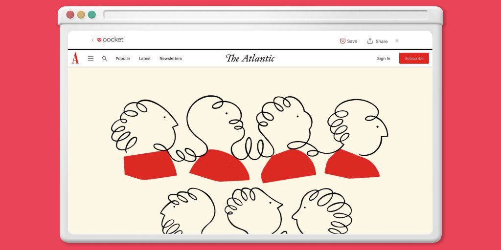
After a few low-fidelity prototypes, I chose an option featuring a subtle top banner to be displayed on top of the publisher’s site.
Process
Since I wanted those designs to feel very close to the final experience, I built them in code, using HTML, CSS and jQuery.
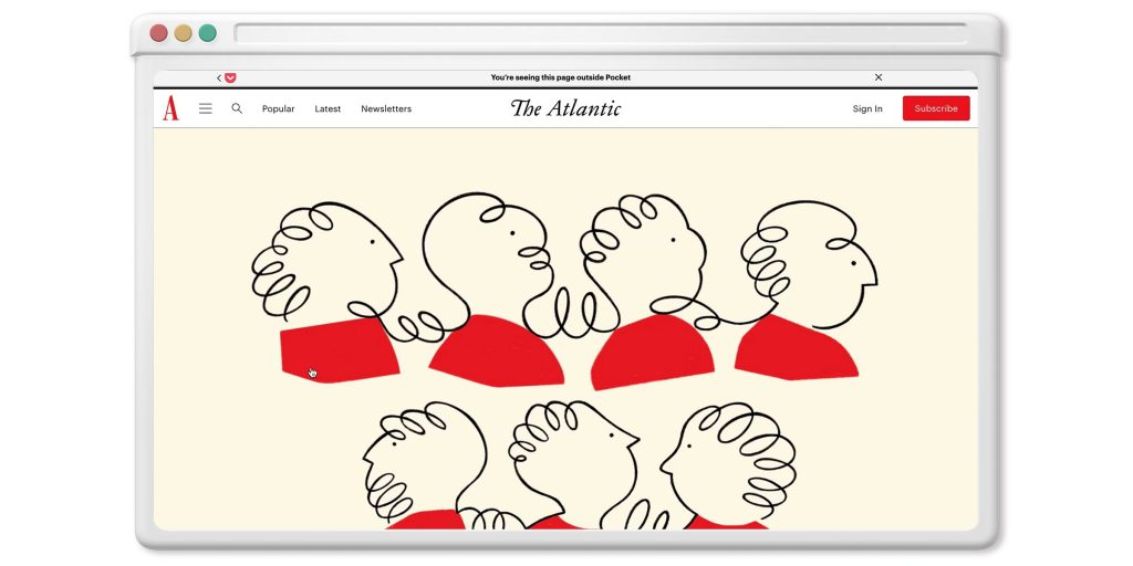
I then prepared the user testing plan in partnership with the researcher and tested the proposal with users. After analyzing the results with the product manager, we were surprised to find that half of the participants disliked the toolbar, primarily mentioning concerns about feeling tracked and perceiving it as adding no value to their experience.
I went back to the drawing board and after multiple iterations I chose a solution that was more aligned with the Pocket brand that would seamlessly connect with the previous screen.
After a second round of user testing, I learned the design was successful this time. Users really liked having the prominent save option and they enjoyed the aesthetics of the toolbar.
Conclusion
Our recommendation on the next step was to do an A/B test.
We expected to see:
- Increase in users returning to Pocket and opening more content from it
- Increase in Saves and Shares
To mitigate the possible negative impact of users disliking the top banner, we recommended keeping track of people who closed it.